
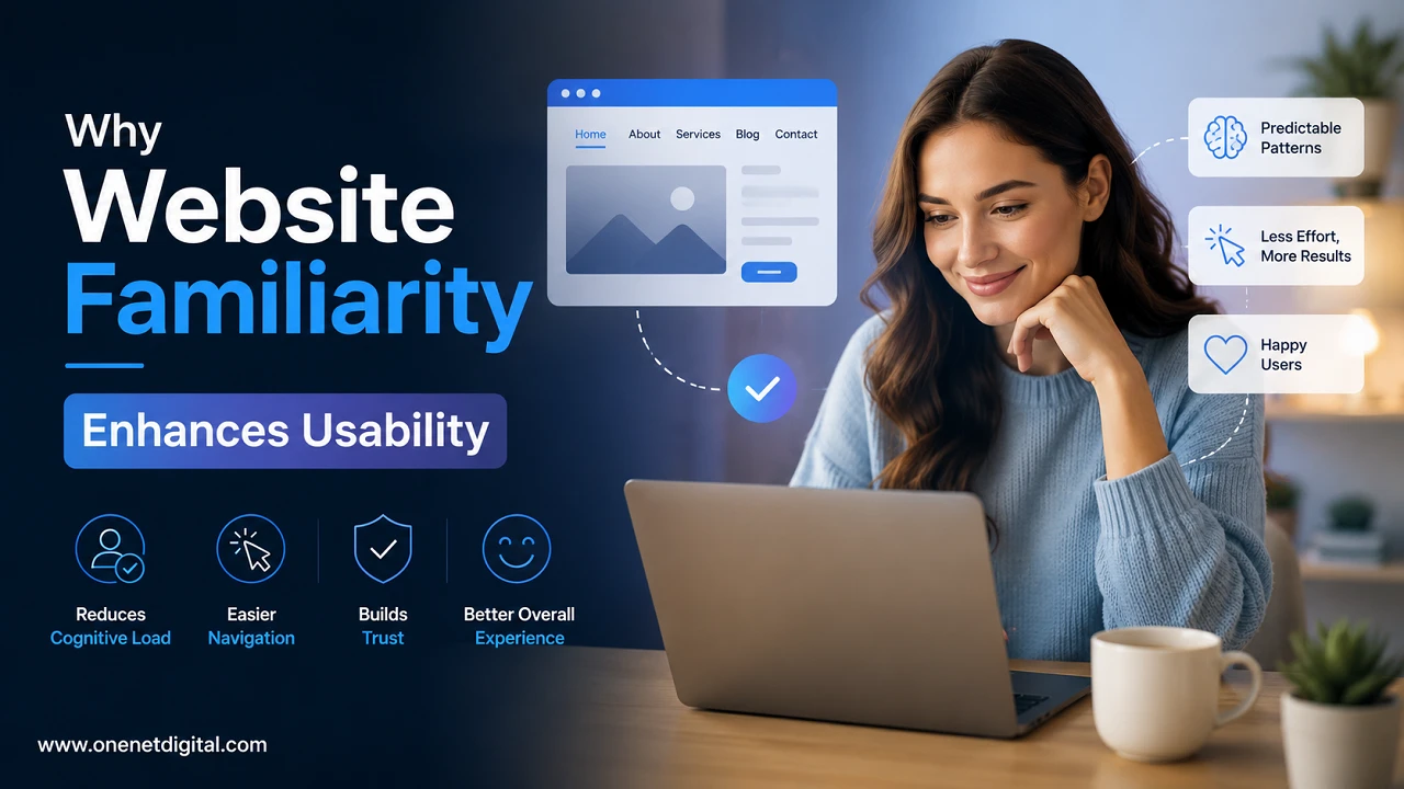
Many people discover a business, product or service from a website. Visitors want information quickly, and to accomplish their goals without confusion. If a website is not user friendly then many users leave within few seconds and look for other alternative. This is the importance of website usability. Familiarity is one of the greatest contributors to usability. When people come to a website that employs common design patterns, they know how to use it. They can find menus, buttons, forms, and important pages without having to spend time learning something new.
Familiarity with a website does not mean copying another website. Rather, it means using layouts and features that people already understand from previous experiences on the web. A familiar website is comfortable, saves time, and creates a better overall experience. A familiar design makes it easier for a person to achieve their goals when shopping online, reading a blog or contacting a business.
What is Website Familiarity?
Website familiarity is the use of common elements and navigation styles that users are familiar with. Some website structures have become familiar to internet users over the years. For example, people expect to see the company logo in the top left corner, the navigation menu across the top of the page, and the search option in a visible location. You’ll usually find contact information in the footer and action buttons like “Sign Up” or “Buy Now” are highlighted.
These common patterns help websites to be more understandable. Visitors may be coming to a website for the first time, but they know where to look for important features because they have seen similar layouts on many other sites.
Why Knowledge Is Important
Usually, people go to a website with a clear purpose. They may want to purchase a product, compare services, read helpful information or contact a company. They don’t want to spend time figuring out how the website works.
When a website sticks to common design patterns, users can concentrate on what they want to do rather than on how to learn the interface. This results in more seamless browsing and less frustration. That makes users more comfortable because everything is where they expect it to be.
Minimises the Learning Curve
All sites have a minimum level of interaction. Visitors click buttons, open menus, fill out forms, and navigate between pages. If these features are designed on familiar features, then users will immediately understand them.
For example, cart icons are usually placed in the upper-right corner of shopping sites. Most users instantly recognise this symbol. Likewise, search bars, login buttons and contact forms are generally in the expected places. The site is more user friendly because of this shorter learning curve.
Also Read: Why People Stop Reading Halfway Through a Page
Builds Trust and Confidence
People trust things they understand by nature. Familiar website layouts help visitors feel more comfortable because they know how to navigate the site.
The clean design, organised menu, clear headings, and visible buttons make the site feel reliable. Business websites and online stores need trust more than ever. When users trust the website, they are more likely to buy or to make enquiries.
Supports Navigation
Navigation is a key part of website usability. Visitors should always know where they are and how to get to other parts of the site.
Logical page structure, label descriptions and clear menus help users to navigate without confusion. Once familiar with the navigation, visitors can easily find products, services, blog posts or contact info.
Enhances Reading Experience
Usability isn’t just navigation. And the way content is presented also matters.
Visitors like sites with clear headings, short paragraphs, readable fonts and enough spacing between sections. A familiar structure for content can help users find information more easily because many scan headings before reading in detail.
Makes Users Make Faster Decisions
People decide within seconds after visiting a website. With easy buttons, recognisable icons, product categories, and organised layouts, visitors can understand their choices.
If someone wants to subscribe to a newsletter, wants a quote or wants to buy a product, familiarity brings them naturally to the next step.
Also Read: How Visitors Decide Whether to Trust a Website
Provides a Consistent Experience
Consistency is a big part of familiarity. All pages should be styled similarly so that the users always know what to expect.
Navigation menus should be in the same place on a website. Buttons should be similar in colour and style. Fonts and spacing should be consistent. It enhances usability and avoids confusion.
Enhances Mobile Usability
A good percentage of website traffic is generated from mobile phones and tablets today. Mobile users need simple, easy to navigate websites on smaller screens.
Responsive design means the navigation patterns you learned still work on other devices. Mobile menus, readable text and large buttons enhance browsing experience.
Better Accessibility Support
Website familiarity also enhances accessibility for users with various abilities.
Websites that have clear navigation, a good heading structure, readable text, links with good descriptions, and consistent layouts, are easier for everyone to use. Standard design practices are also helpful for accessibility tools like screen readers.
Decreases Frustration
Frustrated users often encounter confusing layouts, hidden navigation, unclear buttons, and unexpected page behaviour. Familiar design removes these obstacles by helping visitors know where to click and how to navigate the website.
A frustration-free experience increases satisfaction and the chance of users returning.
Boosts User Engagement
Visitors spend more time on easy-to-use websites. It only makes sense that if they can quickly find content that helps them, they’ll go on to browse more pages.
More engagement often translates into longer time per session, more page views and deeper customer relationships.
Also Read: How to Stop Publishing Content That Adds No Value
Promotes Higher Conversion Rates
The majority of websites have an objective, like making sales, producing leads, or gathering email subscribers.
Users have confidence to perform these actions with familiar interface. Simple forms, clear call-to-action buttons and well organised layouts reduce hesitation and increase conversion rates.
Balancing Comfort and Creativity
Knowing that makes things usable, but it is also important that each website projects its own brand personality.
Businesses can use their own colours, images, typography, and visual styles, while keeping navigation simple and predictable. Creativity should enhance the experience not make simple things more difficult.
How to Make Your Website More Familiar
Website owners can improve usability by providing clear navigation, using descriptive headlines, positioning important information where visitors expect to find it, keeping layouts consistent, and ensuring the website functions well on all devices. Regular testing with real users can also identify areas for improvement.
Summary
One of the best ways to increase usability is to get to know a website. People naturally like websites that are simple, organised, and easy to move around. Familiar layouts reduce the learning curve, increase confidence, support accessibility and help visitors complete their goals faster. They also reduce frustration levels, increase engagement and help to improve conversion rates.
But familiarity is not the enemy of creativity. This means businesses can create unique and appealing websites that follow design patterns users are already used to. By putting usability and design first, website owners can create fun, trustworthy and easy to navigate experiences.
