
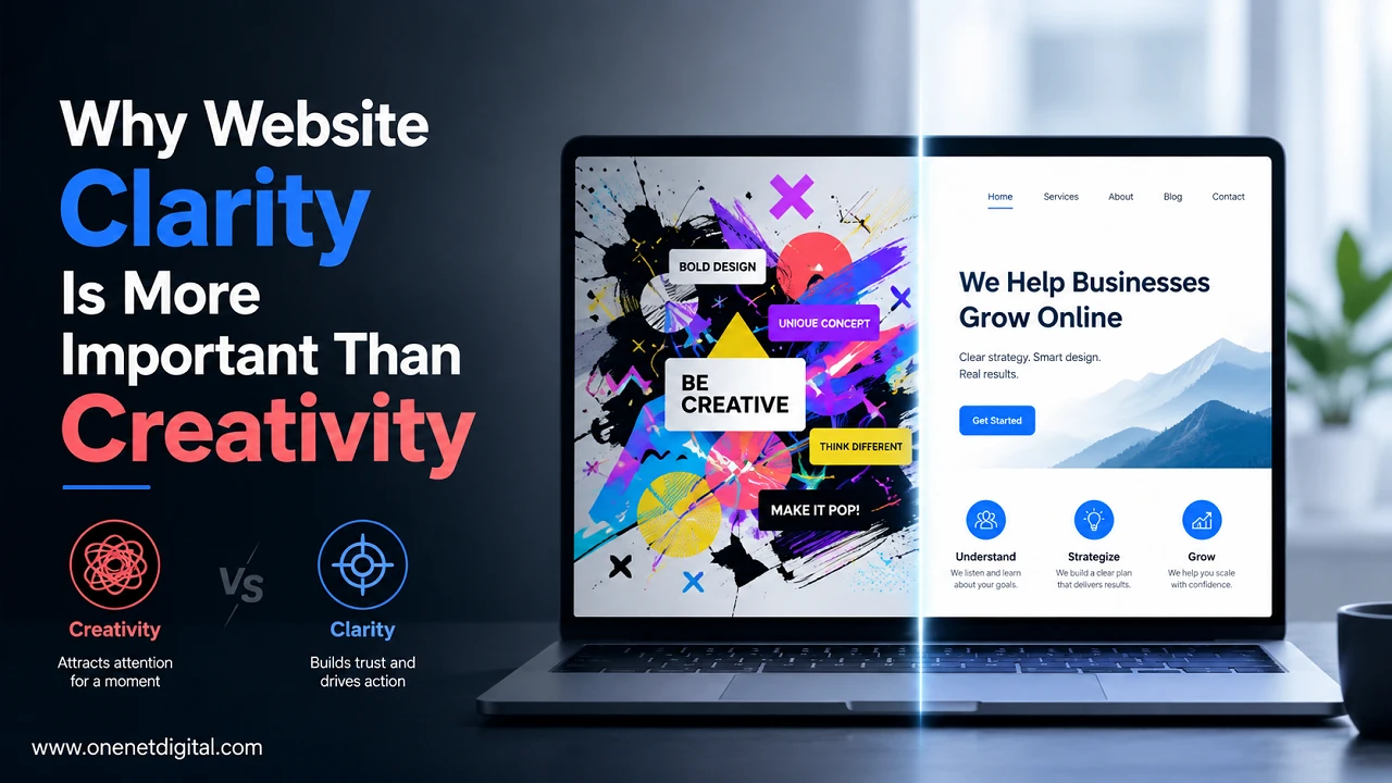
When businesses build a website, they put a lot of effort to make it look unique. They want to impress visitors with complex layouts, animated elements, creative navigation, eye-catchy designs, etc.
There is certainly a place for creativity in web design, but never to the detriment of clarity.
The purpose of a site is to give information, navigation and activities for visitors. No matter how beautiful your website is, it can struggle to achieve its goals if users can’t quickly figure out what your business does, where to find information or how to take the next step.
Website clarity means that the information is presented in a clear, organized and user-friendly way. It helps visitors to navigate easily, understand your message and make decisions confidently.
In this article, we will discuss why website clarity can often be more valuable than creativity and how businesses can build websites that are visually appealing and provide a better user experience.
What Is Website Clarity?
Website clarity is the ease with which a visitor can read, navigate and interact with a website. It’s about providing users with the information in a way that feels simple, organised and intuitive, so they can find what they need without getting frustrated. A clear website lets visitors know immediately what a business does, who the products or services are for, and what they should do next.
Rather than making users work out where information is or how to navigate the site, clarity provides a smooth browsing experience that leads them from one section to another. This means descriptive headings, logical page layouts, consistent design elements, readable typography and visible call to action buttons. When visitors can understand a website in seconds, they’re more likely to stay longer, explore more pages, and take meaningful actions.
Why Creativity Alone Isn’t Enough
Creative web design can certainly help a website stand out, but creativity should not come at the expense of usability. While innovative layouts, animated transitions, decorative typography and unusual navigation may look visually impressive, they can also make it more difficult for visitors to accomplish simple tasks. The majority of users go to a website with a purpose, whether it’s to learn about a service, compare products, request a quote, find helpful information or buy something.
If they have to spend additional time figuring out how the website works, they may get frustrated and leave without doing anything. Hidden menus, too much scrolling effects, overly complex page structures or too artistic interfaces are often more harmful than helpful for user experience. The best websites use creativity to improve communication, not to replace it.
Also Read: How to Measure Content Quality Beyond Google Rankings
First Impressions Depend on Clear Communication
First impression is very important for visitors to stay on a website or leave within seconds. When somebody lands on a homepage, they start hunting for the answers to a few fundamental questions: Am I in the right place? What does this biz do? Will it fix my problem? What do I click next? Clear headlines, short supporting text, and an organized layout for quick answers to these questions help encourage site visitors to continue to explore your website.
Conversely, a home page filled with ambiguous messaging, disruptive images, or perplexing navigation may cause users to lose interest virtually immediately. Clear communication builds confidence as it removes uncertainty and helps users understand the value they’re being offered.
Clear Navigation Improves User Experience
Navigation is one of the most important components of any website and dictates how easily visitors can find information. With a well-defined navigation system, users can hop from one page to another without any hassle, making the whole browsing experience more pleasant and enjoyable. Effective navigation usually means simple menu labels, organized categories, few primary menu options and simple access to important pages like Contact, Services, Pricing or About Us.
Websites should use menu names that visitors will immediately understand. Avoid creative or ambiguous menu names that make users guess what they mean. The good navigation is also consistent all over the website to help users know where they are and how to get to other sections.
Easy-to-Read Content Keeps Visitors Engaged
If the content is hard to scan or understand, no matter how valuable the information, visitors won’t read it. Readability is very important because web users generally skim web pages before deciding to read them thoroughly. Good copy should be broken up into short paragraphs, interspersed with descriptive sub-headings and formatted into bullet points or numbered lists where appropriate.
Instead of technical jargon, the report also uses simple language to make information accessible to a wider audience. Readers may turn away if there are long blocks of text, inconsistent formatting or overly complex explanations. Content in the proper format is easier to read and it’s easier to find needed information.
Also Read: Why Every Website Needs a Content Maintenance Strategy
Clear Calls to Action Increase Conversions
All websites are built with one or more goals in mind, whether it’s generating enquiries, encouraging purchases, collecting newsletter subscriptions or getting appointments scheduled. Clear calls-to-action (CTAs) are vitally important to help visitors achieve these goals. Effective CTAs don’t leave the user wondering what to do next. They give clear direction with simple phrases such as “Contact Us,” “Get Started,” “Request a Quote,” “Learn More,” or “Book a Consultation.”
The buttons should be easy to find, visually distinct from the surrounding content and strategically placed throughout the website. When you make the next step obvious, visitors are more likely to act right away. Confusing, hidden or overly creative CTA labels can decrease engagement because users might not fully understand what will happen when they click.
Simplicity Builds Trust
A simple and organized website usually looks more trustworthy than a cluttered or overly complex one. Clean layouts, consistent branding, readable typography, and transparent messaging all naturally associate visitors with professionalism and credibility. Conversely, websites with excessive animations, inconsistent design components, or an abundance of information can lead to people questioning the authenticity of the business.
Simplicity helps important information to be highlighted and reduces unnecessary distraction that could confuse users. Visitors are typically more comfortable interacting with your business when they can quickly see who you are, what you do, and how to contact you.
Website Clarity Supports Mobile Users
Since mobile devices drive a large portion of website traffic, it’s important to design for smaller screens. Mobile users expect websites to load quickly, display content clearly, and be easy to navigate without excessive zooming or scrolling. A good mobile experience means responsive layouts that automatically adjust to different screen sizes, readable text, well-spaced buttons, simplified navigation menus, and uncluttered page designs.
Creative layouts that make a desktop computer look good can sometimes turn into confusing or hard to use on smartphones. The focus on clarity guarantees that visitors get the same experience no matter which device they use. As mobile usability has an impact on user satisfaction and search engine results, this emphasis on clarity benefits both visitors and website owners.
Also Read: How to Create Content That Supports User Intent Instead of Keywords
Clarity Can Improve SEO
Search engine optimization is so much more than just putting keywords on webpages. Today’s search engines also measure how well a site is serving its visitors, and user experience is an important part of SEO. A clear website will have many elements that aid better optimization such as logical heading structures, descriptive page titles, organized content, internal links, mobile-friendly layouts, and fast loading speeds.
A good indicator that a website contains useful and relevant content is if visitors can find the information they’re looking for easily and spend more time perusing different pages. There’s no one design element that’s going to guarantee higher rankings, but making your website easier to understand will give you a better footing for long-term SEO success.
Creativity Still Has an Important Role
Focusing on website clarity doesn’t mean killing creativity altogether. In fact, creative design helps businesses establish a memorable brand identity and create an enjoyable browsing experience. Colour schemes, high quality images, custom illustrations, modern typography and interactive features can all be used thoughtfully to improve the overall look of a website without making it hard to use.
The key is making sure the creative elements are enabling the user journey, not obstructing it. The visual design should focus on highlighting the important content, reinforcing the branding and improving the communication, instead of inundating the visitors.
Common Mistakes That Reduce Website Clarity
Many sites reduce clarity inadvertently by having design choices that add confusion for no reason. One of the most common errors is to have too much information on one page, that visitors have difficulty finding the most important information. Other issues include vague headlines, inconsistent layouts, conflicting call-to-action buttons, overly complicated navigation menus, poor color contrast, small font sizes, slow-loading animations, and technical jargon that the average visitor wouldn’t understand.
These problems can increase the cognitive effort of the users, forcing them to spend extra time interpreting the website instead of focusing on their goals. Regularly reviewing your website from the perspective of a first-time visitor will give you a good way to spot areas that need improvement.
Also Read: Why Content Depth is More Important Than Content Length
Tips for Creating a Clear Website
Improved website clarity doesn’t always require a full redesign. Small, thoughtful improvements can sometimes make a big difference in how visitors interact with a website. Businesses should focus on writing clear, descriptive headlines, using simple labels for navigation, keeping paragraphs short and easy to scan, and keeping fonts, space and colour schemes consistent throughout the site.
Call to action buttons should be visible and highlight important actions. Visual distractions should be minimized. Regularly testing the site on desktop and mobile devices helps ensure a consistent experience across different screen sizes. You can also achieve more clarity by breaking your content down into logical sections, by updating outdated information, and by reviewing pages for accuracy on a regular basis.
Conclusion
Creativity can make a website visually memorable, but it is clarity that helps visitors achieve their goals.
Clear communication, well-organised information, and a simple user experience increase a website’s ability to build trust and meaningful engagement.
Enterprises should look for balance, not a compromise, between creativity and clarity. Creative design should not make communication difficult.
Simple navigation, readable content, clear calls to action, and user-friendly layouts are what make websites more accessible, more effective, and better able to serve both visitors and long-term business objectives.
Frequently Asked Questions (FAQs)
1. What is website clarity?
Website clarity refers to how easily visitors can understand, navigate, and use a website. It involves presenting information in a simple, organized, and user-friendly way so users can quickly find what they need and complete their desired actions.
2. Why is website clarity important?
Website clarity improves the overall user experience by making it easier for visitors to understand your content, navigate pages, and take action. A clear website can also help build trust, reduce confusion, and encourage users to stay on the site longer.
3. Is creativity important in web design?
Yes, creativity is an important part of web design, but it should support usability rather than distract from it. Creative elements such as visuals, colors, and typography should enhance the user experience while keeping the website easy to navigate and understand.
4. How does clear navigation improve user experience?
Clear navigation helps visitors find information quickly without frustration. Using simple menu labels, organized page structures, and logical navigation paths allows users to move through the website more efficiently.
5. Can website clarity improve SEO?
Website clarity can support SEO by improving user experience. Well-structured content, descriptive headings, mobile-friendly layouts, and logical navigation make it easier for both users and search engines to understand your website.
