
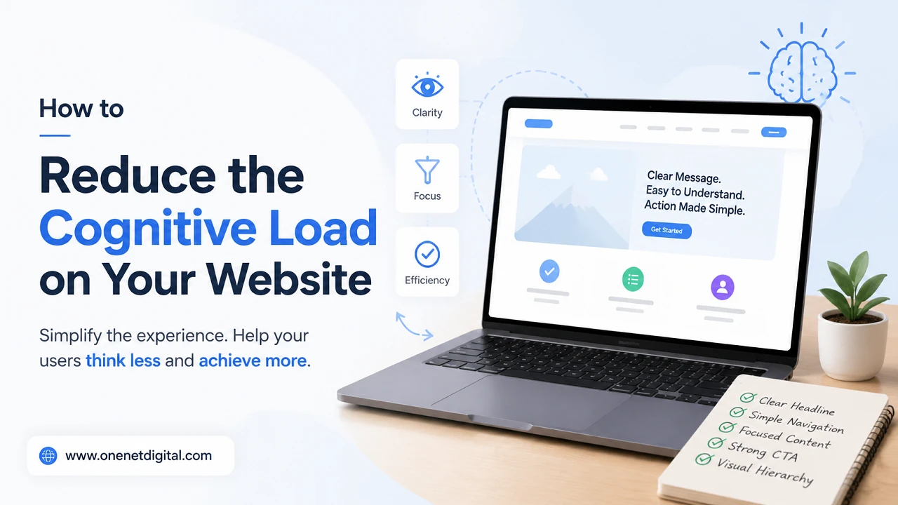
A website should let visitors find information and do what they want to do without confusion. But many websites unintentionally overload users with too much information, confusing navigation, distracting design, or unclear messaging. This increases the cognitive load and makes it harder for people to understand your website and make decisions.
When users spend too much time trying to figure out where to click, what something means, or how to do a task, they often leave the website without doing anything.
Reducing cognitive load doesn’t mean creating a plain or boring website. Instead, it’s about making pages that are intuitive, organised and easy to use. A simpler user experience typically results in higher engagement, better conversions and greater customer satisfaction.
In this guide, you’ll learn what cognitive load is, why it’s important, and how to reduce it on your website.
What Is Cognitive Load?
Cognitive load is the amount of mental effort a person needs to understand information, make decisions and complete tasks when interacting with a website. Visitors arrive with short attention spans, expecting to get information fast and easy. When they have to spend too much time figuring out where to click, how to navigate or what a page is trying to communicate they can get frustrated and leave before they can achieve their goal.
A high cognitive load is usually caused by things such as cluttered navigation menus, long paragraphs of text without headings, multiple competing calls to action, confusing layouts, long forms and too many colors, fonts or animations.
Why Reducing Cognitive Load Matters
Reducing cognitive load is significant because it directly impacts how visitors interact with your website. When users can easily understand your content and navigate through different pages, they are more likely to stay engaged and complete important actions. A well-organized website enhances the browsing experience, which can lead to a rise in user satisfaction, lower bounce rates, and prompt visitors to delve deeper into your site.
Making your site easier to use also means that it is more accessible to people with varying degrees of technical knowledge. By getting rid of unnecessary distractions and presenting information in a logical way.
Keep Your Navigation Simple
Website navigation acts as a roadmap to guide visitors to what they need. If the navigation menu is cluttered or disorganized, it can be hard for users to find important pages and leave the site. Simple navigation: Use clear menu labels that describe the content of each section, group related pages together, and avoid unnecessary drop-down menus. Uniformity across all pages also helps users to get acquainted with your site structure. A simple navigation system reduces confusion and saves time when finding key information.
Also Read: How to Build a Website That Answers Customer Questions More Quickly
Break Content into Smaller Sections
Good information can be difficult to absorb when it is presented in large blocks of continuous text. The majority of online users prefer to skim content before deciding whether to read it in detail. Divide content into smaller sections with descriptive headings and subheadings, bullet points, numbered lists and short paragraphs to make it easier to navigate. This structure allows readers to quickly find specific information without being overwhelmed by too much text. Well-structured content also makes it easier to read on mobile devices.
Maintain Consistent Design
Consistency on your website helps visitors get accustomed to the way it looks and works. Users figure out how each page works faster when the fonts, buttons, colours, icons, and page layouts are consistent across the website. Visitors are able to concentrate on the information they are looking for rather than constantly having to determine the location of key elements. Consistent design creates a sense of familiarity and professionalism and reduces unneeded mental effort.
Remove Visual Clutter
Every visual element on a page should have a purpose. Too many banners, pop-ups, animations, decorative graphics or advertisements can distract visitors from the main content and make the page look messy. A busy layout means the user has to sift through unnecessary information before they can get to the information they need. Proper use of white space breaks up the different content areas, and results in clearer, more structured pages. A well-balanced design helps important information stand out naturally, and makes browsing feel calmer and more comfortable.
Make Calls to Action Easy to Understand
Calls to action guide visitors to the next step they should take, so they should always be clear and easy to understand. Generic buttons such as “Click Here” or “Learn More” often offer little context about what will happen next. More descriptive phrases such as “Request a Quote,” “Contact Our Team,” “Download the Guide,” or “View Pricing” give visitors more confidence in their decisions. Clear calls to action reduce uncertainty, improve usability, and help users move through the website without hesitation.
Also Read: How to Find Why Your Website Traffic Isn’t Converting
Improve Form Simplicity
Forms are often one of the final steps in a user’s journey, so it’s important to keep them as simple as possible. Long forms with unnecessary fields can deter users from filling out enquiries, registrations, or purchases. Only ask for the information that you really need and order the fields in a logical sequence. It’s easier to fill out forms when they have clear labels, helpful placeholder text, and good error messages. Additional ways to reduce friction and increase completion rates include allowing browser autofill and making your forms mobile-friendly.
Use Visual Hierarchy
Visual hierarchy guides users through content to determine what information should be given the most attention. They can lead visitors across a page without overwhelming them with larger headlines, bold text, contrasting buttons, proper spacing, and organised layouts. The most important information should be immediately obvious and the supporting details should be easy to find when needed. A good visual hierarchy helps users scan pages more quickly, find answers more easily, and understand the overall message with less mental effort.
Reduce Decision Fatigue
The more options a user has simultaneously, the harder it is to make decisions. This phenomenon, known as decision fatigue, often leads visitors to delay action or leave the site. Don’t over-clutter your pages with lots of buttons, links or competing offers. Focus on the most important actions and remove the distractions. Offering fewer options that are more relevant makes it easier for visitors to choose with confidence, and creates a smoother, less overwhelming browsing experience.
Optimize for Mobile Users
With more people browsing sites on smartphones and tablets, mobile usability has become more important. Simpler is better because smaller screens don’t have room to display content. On mobile this means creating responsive layouts, buttons that are easy to tap, font sizes that are easy to read, simple navigation, and content that is spaced out. A mobile-friendly website allows visitors to comfortably browse without excessive zooming, scrolling, or accidental clicks, improving usability and overall satisfaction.
Also Read: How to Evaluate Your Website from a Customer’s Perspective
Improve Page Speed
Website speed is a major aspect of user experience as slow-loading pages break a visitor’s thought process and lead to frustration. Each additional second spent waiting can decrease engagement and increase the chances that users will leave the website. Optimizing images, cutting down on unnecessary scripts, enabling browser caching, reducing code complexity, and using modern image formats can greatly improve loading performance. Fast pages keep users focused on your content and completing what they came to do, without unnecessary delays.
Provide Clear Feedback
It’s always good practice to give visitors clear feedback after they interact with your website. When users submit a contact form, click a button or enter incorrect information, the website should immediately let them know what happened. Loading indicators, confirmation messages, highlighted form errors and active navigation states reduce uncertainty. Clear feedback lets users know that their actions have been received, and encourages them to continue to interact with the website with confidence.
Make Important Information Easy to Find
Visitors should not be forced to hunt around for crucial details. Contact details, operating hours, cost information, services, FAQs and support policies should be clearly visible in easily accessible areas. Users get frustrated when information is hidden or difficult to find and may lose trust in the website. Presenting important information in an organized manner will help visitors achieve their goals faster and provide for a more positive overall experience.
Use Familiar Design Patterns
Most internet users are already familiar with the common website layouts and navigation patterns. Having your logo in the top left corner and navigation at the top of the page, providing a visible search bar, providing a footer with more links, and using familiar shopping cart icons in eCommerce websites, users feel comfortable right away. By adhering to these well-known conventions, the learning curve is reduced and visitors can navigate naturally without having to figure out how the website works.
Also Read: How to Spot Trust Issues Before Visitors Leave
Test Your Website with Real Users
The best designed websites can have usability issues that are hard for their designers to find. Testing usability with real users is a great way to learn how visitors actually use your website. Have participants perform common tasks such as finding a service, contacting your business, filling out a form, or finding pricing information. The best places to look for ways to make navigation easier, organize content better, and reduce cognitive load are where users get confused or stumble. By regularly testing your website, you can ensure that it continues to meet user expectations as it changes and grows, keeping it up to par.
Common Mistakes That Increase Cognitive Load
Bad design decisions on many websites inadvertently adds unnecessary complexity. Common mistakes include overcrowded navigation menus, competing calls to action, inconsistent layouts, technical language, too many pop-ups, poor spacing, too small fonts, cluttered homepages, long forms, and hidden navigation elements. Each of these problems may seem minor on its own, but together they can dramatically increase the mental effort required to use a website. Another way is to regularly review your website as a visitor would and cut out the unnecessary complexity and improve usability, engagement and the overall user experience.
Conclusion
It’s about lowering the cognitive load so your website is easier to navigate and understand. Visitors stay more engaged and achieve their goals when they can easily find information, understand your content, and complete tasks without confusion.
Intuitive navigation, easy-to-understand language, consistent design, well-structured content and considered layouts all contribute to a better user experience. Rather than adding more elements, try to remove unnecessary complexity and present information in a clear, structured way.
From a user’s perspective, regularly evaluate your website and streamline where you can to create a more effective experience for your visitors and your business.
FAQs
1. What is cognitive load in web design?
Cognitive load in web design refers to the amount of mental effort users need to understand a website, find information, and complete tasks.
2. Why is reducing cognitive load important for a website?
Reducing cognitive load improves the overall user experience by making websites easier to understand and navigate. It can increase visitor engagement, reduce bounce rates, improve accessibility.
3. What causes high cognitive load on a website?
High cognitive load is often caused by cluttered layouts, confusing navigation, too many menu options, lengthy forms, excessive animations, multiple calls to action, inconsistent design, and complicated language.
4. How can simple navigation reduce cognitive load?
Simple navigation allows visitors to find information quickly without searching through numerous menus or confusing page structures. Clear labels.
5. Why should each webpage have one primary goal?
A webpage with one clear objective helps visitors focus on the most important action without becoming distracted by multiple competing options. Whether the goal is to generate inquiries, encourage purchases.
