
Introduction
Every business wants to get more leads, enquiries and customers from their website. But a lot of websites have a common problem. Visitors start the customer journey, but don’t go all the way to completing an important action. They might come to the homepage, check out a service page, browse a few sections then disappear without contacting the business or buying anything.
These drop-offs can have a serious impact on business growth because every visitor that leaves is a lost opportunity. Often businesses think they need more traffic but, in many cases, the real problem is hidden in the customer journey itself.
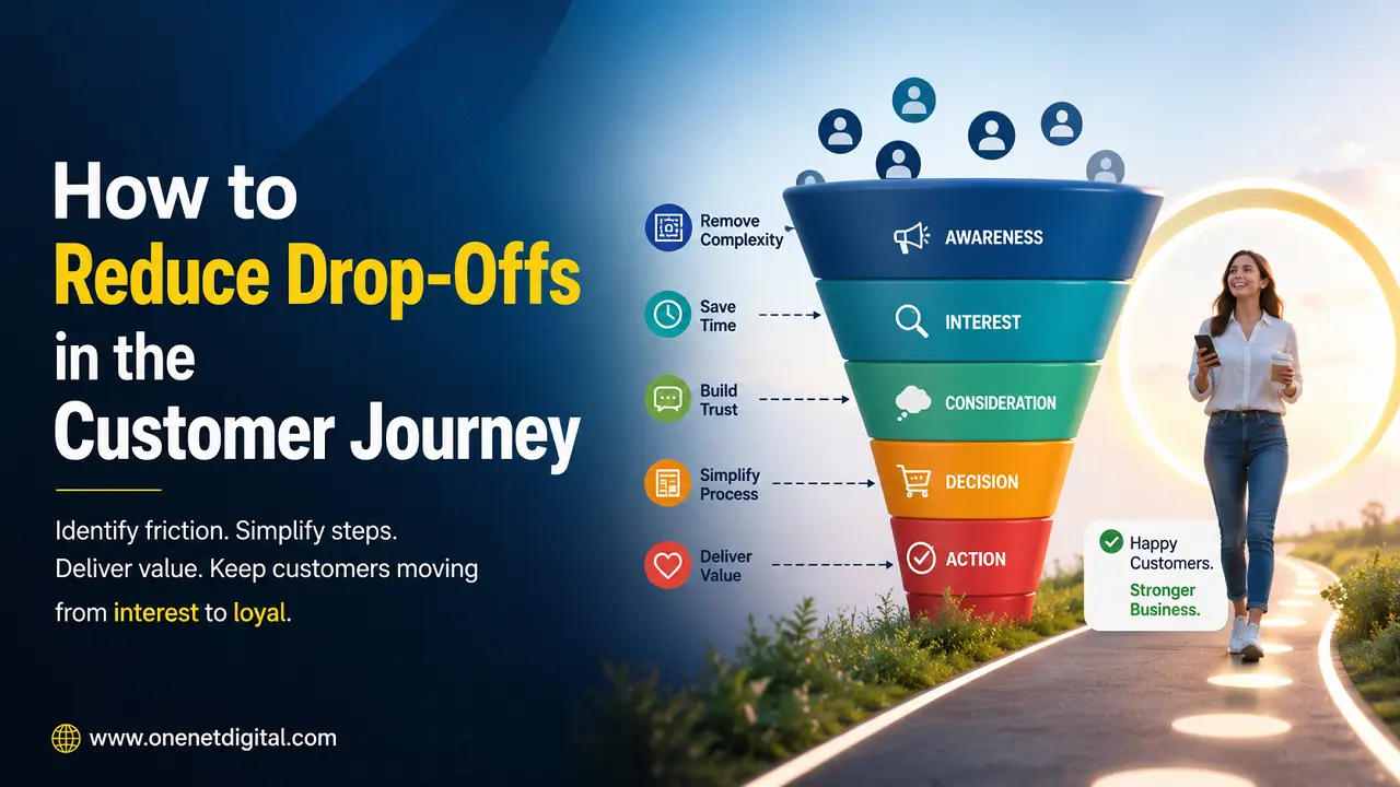
The customer journey is the entire path a visitor takes from the moment they land on your website until they become a lead or customer. If users have any confusion, friction or uncertainty at any stage, they will probably give up on the process.
The good news is that many drop-offs can be reduced by understanding user behaviour and making improvements that lead to a smoother and more helpful experience.
Understand Where Visitors Are Leaving
The first step in reducing drop-offs is to find out where they’re happening.
Many businesses know how much traffic their website gets, but they don’t really know how visitors navigate through the site. Analytics data can provide valuable insights on pages with high exit rates, low engagement and poor conversion performance.
For example, visitors may leave repeatedly after viewing a service page or leave the site before even seeing the contact form. These patterns are often a sign that something in the customer journey is causing them to stop and think.
By seeing where users drop off, businesses can concentrate on improving the most important things.
First Impression Should Be Clear and Relevant
The first few seconds of visiting a website are very important.
Visitors make split-second decisions about whether a website looks relevant to them. If they can’t instantly figure out what the business is and how it can help them, they may leave without looking any closer.
Many websites fall into the trap of using vague headlines, complex messaging or generic marketing language. Visitors shouldn’t have to guess what services are available.
A clean, simple introduction tells users they are in the right place and encourages them to keep going on their journey. The easier your value proposition is for visitors to understand, the less likely they are to bounce early.
Also Read: How to Create Service Pages That Generate Inquiries
Make Website Navigation Easier
Poor navigation is a leading cause of users abandoning websites.
Visitors have particular goals. They may want to learn about your services, see your experience, get pricing info or contact your business. Frustration starts to creep in if they can’t find what they need quickly.
Navigation needs to be simple and predictable. The most important pages should be easy to find, and users should never get lost as they move through the site.
The simple navigation structure allows users to flow naturally through the customer journey and find information without unnecessary effort.
Reduce Unnecessary Friction
Anything that makes the customer journey harder than it needs to be is friction. Small obstacles are enough to make users abandon. Common sources of friction are:
- Slow-loading pages
- Excessive popups
- Long forms
- Confusing page layouts
- Difficult mobile experiences
- Too many steps before taking action
Most visitors prefer websites that seem easy to use. The more effort that is required to reach a goal, the more likely the goal will be given up.
By reducing friction, you create a smoother experience that encourages visitors to go further down the conversion process.
Answer Important Questions Early
Many users go away with unanswered questions.
Visitors usually want to know about services, prices, timelines, experience and processes before they contact a business. If these questions are not answered, users might continue their research elsewhere.
Others believe visitors will enquire for more information. But today’s users like to learn as much as they can before entering conversations.
The website must be able to foresee typical customer problems and explain them in simple terms along the way. When visitors feel informed, they are more willing to take the next step.
Also Read: How to Improve Contact Form Conversion Rates
Build Trust at Every Step
Trust is key at every point in the customer journey.
If visitors are uncertain about the credibility of a website, they won’t continue to explore it. Even if they have an interest in the services being offered, uncertainty can quickly lead to drop-offs.
Customer reviews, testimonials, case studies, clear contact information, certifications, and professional design can also contribute to building trust.
Trust should not be limited to the contact page. It should be there for the whole website experience. Every interaction should build confidence and tell visitors your business is trustworthy and professional.
Enhance Mobile User Experience
A big percentage of website visitors today browse on smartphones. Sadly, many businesses underestimate the importance of mobile usability.
Big problems on small devices a desktop friendly website can create big problems on smaller devices. Tiny text, difficult navigation, slow performance, and complicated forms can all drive up abandonment rates.
Visitors want convenience, on whatever device they are using.
Businesses should test their websites regularly on mobile devices and make sure every step of the customer journey is easy and accessible.
Better mobile experience often means more engagement and less drop-off.
Create Clear Calls-to-Action
Many visitors leave because they do not know what to do.
Users should always be aware of their options after reading content. Ensure the next step is obvious, whether it is asking for a quote, scheduling a consultation or getting in touch with the business.
A website should lead its visitors along naturally, not make them look for ways to get on.
Clear calls-to-action reduce uncertainty and keep users moving along the customer journey. The easier it is to take action, the less likely it is that you’ll abandon it.
Reduce Decision Overload
Many websites mistakenly overwhelm visitors with too many choices.
Multiple offers, too many navigation links, competing buttons and lots of calls-to-action can confuse. Sometimes there are too many options to help users to decide, but instead it makes it harder to make decisions.
When people are overwhelmed, they tend to delay or walk away.
A focused website experience directs attention to important actions and removes distractions. Simple is often better, as visitors can decide more confidently.
Also Read: How to Generate More Leads from Existing Website Traffic
Use Analytics and Behavior Tools
Website analytics helps us understand how our customers behave.
Bounce rates, exit rates, time on page, conversion paths and other metrics help businesses to identify where users get stuck. Heatmaps and session recordings can give even deeper insights into visitor behaviour.
For example, behaviour tools might reveal that visitors never reach a call-to-action because it’s too far down the page. They can also be a sign of confusion caused by bad layouts or non-clickable elements.
Knowing how your customers are using your website allows you to discover problems that aren’t obvious and improve based on real behaviour instead of assumptions.
Optimize Your Contact Process
Visitors may be interested in your services and may be willing to get in touch with your business, but a complicated inquiry process can lead them to leave.
Long forms, unnecessary fields, confusing instructions and privacy concerns can all put users off completing the process.
The contact experience should be simple and reassuring. Only receiving the information that is necessary and clearly stating what happens next can go a long way in improving conversion rates.
A smooth last step can often be the difference between a lost opportunity and a new lead.
Constantly Review and Enhance the Customer Journey
Customer expectations are constantly evolving. What was a good customer journey a few years ago, may not be up to modern user expectations.
Businesses should regularly test their websites from the perspective of a first-time visitor. Small improvements to content, trust signals, navigation and usability can dramatically reduce abandonment rates.
The goal isn’t to create a perfect website. The goal is to remove barriers that prevent visitors from naturally moving towards conversion. Big redesign projects are often better for the long-term than continuous optimization.
Also Read: How to Improve User Experience Without Hiring a Designer
Conclusion
To reduce drop-offs in the customer journey, you need to know how people experience your website from start to finish.
Some of the most common reasons why users abandon websites include confusing navigation, unanswered questions, poor mobile usability, lack of trust, too much friction and unclear calls-to-action. Fortunately, careful analysis and constant improvements can detect and resolve many of these problems.
Successful websites for 2026 are about creating smooth, intuitive customer journeys that allow visitors to easily find information, build confidence and take action.
This will reduce friction and enhance every aspect of user experience and help businesses convert more of their existing visitors into valuable leads and long-term customers.
FAQs
1. What causes the drop-offs in customer journey?
Common reasons include poor user experience, lack of trust, confusing navigation, slow websites and unclear calls-to-action.
2. How do I know where visitors leave my website?
Analytics, exit rates, heatmaps and session recordings to analyze user behaviour.
3. Will optimizing for mobile decrease customer drop-offs?
Yes, a seamless mobile experience can lead to a big lift in engagement and conversions.
4. How trust signals play a role in the customer journey?
Trust signals ease visitors’ minds, making them more comfortable to continue toward conversion.
5. Can small fixes on a website reduce the abandonment rate?
Definitely. Even small improvements in usability, clarity and navigation can lead to deeper engagement and more conversions.