
Introduction
Visitors to a website are continually making small decisions about where to click next. They scan headings, menu items, buttons and links looking for clues that will help them get to the information they need. Where those clues are clear, visitors continue their exploration. Users often leave the website altogether if it is confusing or misleading.
This is called information scent. This is about the signals a website gives to users about where to go to find relevant information. Strong information scent builds confidence in visitors that they are headed in the right direction, while weak information scent creates uncertainty and increases the chances that users will leave the site.
Companies often accidentally dilute their information scent by using vague navigation labels, unclear calls to action, or page titles that don’t tell visitors what they’re going to find. This leads to users spending more time in search and less time interacting with the website.
Redesigning your website isn’t about better information scent. It’s about making every navigation choice, heading and link speak clearly so visitors can find answers with the least effort.
Understand What Visitors Need to Know
Before improving information scent, companies need to understand why people visit their website in the first place. Every visitor has a goal, whether it is to learn about a service, compare options, check prices, or find contact information.
If the structure and content of the website match these goals, visitors know where they should go next. But if the navigation is based solely on business terminology or internal categories, users will have a hard time finding what they’re looking for.
The most effective websites are built around customer expectations, not company structures. Thinking from the visitor’s perspective allows for clearer pathways and less confusion throughout the browsing experience.
Use Clear Navigation Labels
Navigation is one of the best sources of information scent on a web site.
Visitors should know immediately what a menu item contains before they click on it. Labels such as “Services”, “Pricing”, “Portfolio” or “Contact” provide clear expectations. Creative or ambiguous names on the other hand may seem unique, but often leave users guessing.
When visitors can’t anticipate what’s behind a menu option, they hesitate. That hesitation breaks the flow of the browsing experience and increases the chance of abandonment.
Clear, descriptive navigation allows users to browse with confidence and improves the overall experience.
Make Headings Match User Expectations
Page headings are very important for visitors to guide them. They need to instantly confirm that users have found the right place.
For example, if a user clicks on a link about website speed, the heading should say clearly that the page is about improving website speed. An unclear or irrelevant heading can cause visitors to think they clicked the wrong link.
Information scent is more robust when messaging is consistent across search results, navigation links, and page headings. Users feel confident when each step of their journey delivers on expectations.
Strong headings also make pages more scannable, allowing visitors to find relevant information faster.
Also Read: How to Help Your Website Outperform Your Competitors
Write Descriptive Call-to-Action Buttons
Many websites have generic buttons such as “Learn More,” “Read More,” or “Click Here.” These are common phrases, but often don’t tell users what will happen when they click.
A more descriptive button creates a stronger information scent by explaining the action or destination. Visitors are more likely to click when they know exactly what they are going to get.
For example, a button that says “View Website Design Services” is far more communicative than one that simply says “Learn More.” These small wording tweaks reduce uncertainty and help users make decisions more confidently.
Keep Related Information Connected
Visitors often need more than one piece of information before they can make a decision. Someone reading about SEO services might also want to read about pricing, case studies or FAQs.
Internal links enable those connections. Related pages should guide visitors to the next step in their journey naturally, rather than making users manually search.
When related information is logically connected, the website feels more intuitive. Users spend less time thinking about where to go and more time engaging with the content.
Good internal linking also assists search engines in understanding how the various topics on the site connect with one another.
Avoid Using Misleading Titles and Links
Nothing weakens information scent faster than links that promise one thing but deliver another.
If a heading provides practical advice, but leads to a sales page, visitors may lose trust immediately. Likewise, disappointment is often the result of titles that exaggerate or misrepresent the content.
Every link must correctly describe what the user will find after clicking. Visitors are more satisfied and likely to continue exploring the site when expectations are clear.
Honest labelling builds credibility and creates a more seamless browsing experience.
Organize Content Around Common Questions
People usually don’t go to websites without a reason. Most come with a question that needs to be answered.
Instead of simply organizing content by business category, businesses should also think about the questions that customers ask all the time. Building pages around these questions naturally improves information scent, because visitors can immediately recognize content that meets their needs.
Instead of building vague sections, businesses can organize resources by topics such as improving website performance, increasing leads, or understanding SEO.
This approach helps visitors find relevant information faster, and makes the website more useful.
Also Read: How to Reduce the Cognitive Load on Your Website
Reduce Unnecessary Choices
When visitors are faced with many navigational options at once, decision-making becomes more difficult.
When users are confronted with dozens of menu items, multiple calls to action, and multiple competing pathways they often pause, because they are not sure which option is the right one.
A cleaner navigation structure improves information scent by minimizing distractions and highlighting the most important choices. Visitors should always know what comes next.
Choices are not eliminated with less information of value. It just presents information in a way that is easier to understand.
Test Your Website from a New Visitor’s Perspective
Business owners know their websites inside out, so it’s hard to see the confusing parts.
One of the best ways to improve information scent is to critique the website as if you were seeing it for the first time. Ask yourself: is the navigation intuitive, are the headings descriptive of the content, is the important information easily findable?
Or you can ask colleagues, customers or friends to do simple things on the website without help. Often, watching where they stall can help you figure out ways to improve the navigation and content structure.
Small changes based on real user behaviour can often have a large impact on usability.
Continuously Improve Based on User Behavior
Information scent is not something that is optimized once and forgotten. As businesses grow, and websites grow, navigation structures and user expectations change.
Website analytics, heatmaps, and customer feedback can all tell you where visitors are getting lost or leaving unexpectedly. Pages with high exit rates or low engagement might suggest that people are struggling to find what they were looking for.
Over time, regular reviews allow businesses to fine tune headings, navigation labels, internal links, and page structures. Continuous improvements keep a website easy to navigate and a valuable site for users.
Also Read: How to Build a Website That Answers Customer Questions More Quickly
Conclusion
The term information scent may not be familiar to every website owner, but it is vital to the user experience. Headings, menu items, internal links and calls to action all send signals that help visitors decide where to go next.
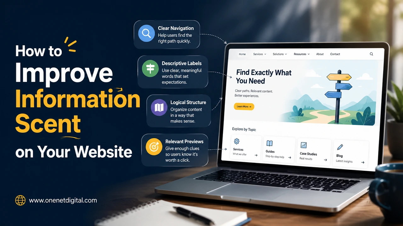
By using good navigation design practices such as clear navigation labels, descriptive headings, related information, less choices and grouping according to customer needs, businesses will be able to create a website that is a natural, easy-to-peruse experience.
Websites that are successful in 2026 are not just the ones with nice designs. They’re sites that guide visitors naturally, answer questions efficiently and make every click seem like the right decision. All of these are easily and powerfully achieved through improving information scent.
FAQs
1. What is information scent in web design?
Information scent is the clues a website gives visitors that help them predict where links, pages or navigation will lead.
2. Why is information scent important?
Strong information scent helps users find information faster, reduces confusion and improves overall website usability.
3. How do I improve information scent on my website?
Use clear navigation labels, descriptive headings, meaningful call-to-action buttons, logical internal links, and organize content around user needs.
4. Does information scent affect SEO?
Indirectly, yes. Easier navigation and user experience can increase engagement, making your website easier to understand for both visitors and search engines.
5. How do I know if my website has poor information scent?
If your visitors are often leaving pages, can’t find what they need, or aren’t clicking, you might need to rethink your navigation and how you organize your content.
