
- What is Website Friction?
- Why Friction Reduces Conversions
- Simplifying Navigation Improves User Experience
- Faster Loading Times Encourage Action
- Simplifying Forms Increases Completion Rates
- Clear Calls to Action Reduce Confusion
- Improving Mobile Usability Matters
- Building Trust Reduces User Hesitation
- Streamlining the Checkout Process
- Continuously Testing and Optimizing
- Conclusion
- Frequently Asked Questions
Part of the challenge in today’s competitive digital landscape is getting visitors to a website. The real goal is to turn those visitors into customers, subscribers, leads or engaged users. Friction across the entire journey is one of the most effective ways to improve conversion rates.
Friction on a website is anything that makes it difficult, confusing, or time-consuming for visitors to do something you want them to do. Little hurdles can discourage users from taking the next step, leading to lost opportunities and lower conversion rates.
By understanding how friction affects user behavior, businesses can design smoother experiences that keep visitors engaged and convert more often.
What is Website Friction?
Website friction is anything that interrupts or slows a user’s path to taking an action. That action could be a purchase, a contact form submission, a newsletter subscription, a resource download, or a quote request.
Friction can come from a variety of sources including:
• Navigation is complicated
• Slow load times for pages
• Form fields overload
• Confusing site layouts
• Ambiguous calls to action
• Forced account generation
• Bad mobile usability
• Hidden charges at checkout
When users encounter these hurdles, they might get frustrated and leave the website before converting.
Why Friction Reduces Conversions
Internet users want quick and simple experiences. They want to find information fast and get things done with the least amount of effort.
If a site creates unnecessary obstacles, visitors can get bored and leave. If the process looks too complicated, even interested users can be put off.
Studies show that if a website is simple, intuitive and easy to use, people are more likely to act. Reducing friction helps users remain focused on their goals and increases the chances of conversion.
Also Read: Why Some Pages Get Traffic but No Conversions
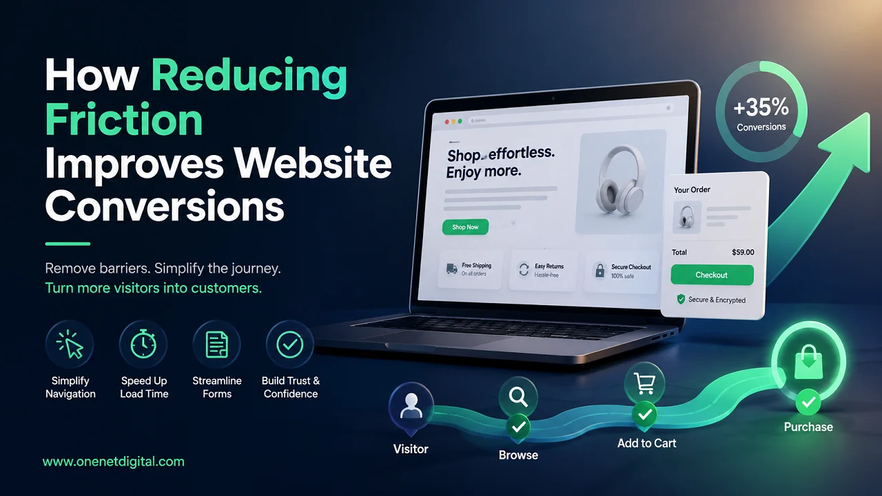
Simplifying Navigation Improves User Experience
Navigation plays a big part in the way visitors interact with a website. It should be easy for users to find what they are looking for without having to dig through a bunch of pages.
The clearer and more organized the menu structure, the easier it is for visitors to navigate the site. Usability is enhanced by simple menu labels, logical organization of pages, visible search options and easy-to-find contact details.
If users are able to find what they’re looking for easily, they are more likely to stay engaged and stay on the path to conversion.
Faster Loading Times Encourage Action
Website speed is a critical factor in user satisfaction. Visitors generally expect pages to load within a few seconds.
Slow pages can annoy users and lead to increased bounce rates. Visitors may leave prior to viewing important content or making a purchase.
Optimizing images, enabling browser caching, choosing efficient hosting and cutting back on unnecessary scripts will improve page speed, create a smoother user experience, and improve conversions.
Simplifying Forms Increases Completion Rates
Forms are often used to collect leads, inquiries and registrations. But long or complicated forms can put off users from filling them out.
A lot of people like to give the minimum amount of information, especially the first time they’re dealing with a company.
By making forms short, using clear labels and providing helpful instructions, completion rates can be improved and abandonment reduced.
Also Read: How Website Consistency Builds Customer Confidence
Clear Calls to Action Reduce Confusion
Calls to action help users to the next step. Visitors don’t know what to do without clear direction.
It is easy to find on the page and use plain language. Examples include “Contact Us Today,” “Request a Free Quote” or “Learn More.”
Clear calls to action that guide visitors through the conversion process with confidence.
Improving Mobile Usability Matters
A significant percentage of website traffic now comes from mobile devices. Visitors can quickly leave a website that is hard to use on a smartphone.
Typical mobile usability issues are small buttons, difficult navigation, slow loading times, and hard-to-read text.
Responsive design guarantees a smooth experience for users across all devices, resulting in higher engagement and conversions.
Building Trust Reduces User Hesitation
Online users need to be able to trust that they can make decisions. Visitors are more likely to take action when they trust the credibility of a website.
Building trust through elements like customer reviews, testimonials, security badges, privacy policies, and professional design.
When users feel secure, they are more comfortable sharing information or making purchases.
Streamlining the Checkout Process
The checkout process is one of the most important stages in the customer journey on e-commerce websites. A difficult checkout process can lead to abandoned shopping carts.
Hidden fees, lengthy forms and having to set up accounts can create friction for customers.
Offering guest checkout, showing costs upfront and simplifying the payment process can help increase completed transactions.
Also Read: Why People Bounce From Your Website Without Clicking Anything
Continuously Testing and Optimizing
Ongoing improvement is necessary to reduce friction. User expectations and technology continue to evolve over time.
Ask to test regularly to find the pain points visitors might experience. Tools like heatmaps, A/B testing, customer feedback and conversion analysis provide great insights.
By constantly improving the user experience, businesses can remove barriers and increase website performance.
Conclusion
Website conversions are often about how easy it is for visitors to take action. Any unnecessary step, delay or confusing element can create friction that prevents users from completing their journey.
This can be achieved by simplifying navigation, improving page speed, optimizing forms, creating clear calls to action, enhancing mobile usability, building trust, and streamlining checkout processes, all of which contribute to a more seamless experience for visitors.
By reducing friction, you don’t just increase conversion rates, but you also improve customer satisfaction, brand perception, and long-term business growth. Websites that are focused on simplicity and user-friendliness are more likely to make visitors into loyal customers.
Frequently Asked Questions
1. What does website friction mean?
Website friction refers to any obstacle that makes it harder for visitors to complete an action on a website, such as filling out a form, making a purchase, or finding information.
2. How does friction affect website conversions?
Friction can cause frustration and confusion, leading visitors to leave a website before completing their desired action. Reducing friction helps improve conversion rates.
3. Why is website navigation important for conversions?
Clear and organized navigation helps users find information quickly. When visitors can easily move through a website, they are more likely to stay engaged and convert.
4. How does page speed influence user behavior?
Fast-loading pages create a better user experience and reduce bounce rates. Slow websites often cause visitors to leave before interacting with content or completing a transaction.
5. What are some common causes of website friction?
Common causes include slow page speeds, complicated navigation, lengthy forms, unclear calls to action, poor mobile design, and difficult checkout processes.