
Introduction
Website design isn’t just about creating visually attractive pages. Every design decision influences how users feel when interacting with a website. One of the strongest elements affecting customer behaviour online is color.
In 2026, businesses are paying far more attention to website color psychology as users are making decisions very quickly now. Visitors decide what they think of a website in just a few seconds, and colors play a big part in forming those first impressions.
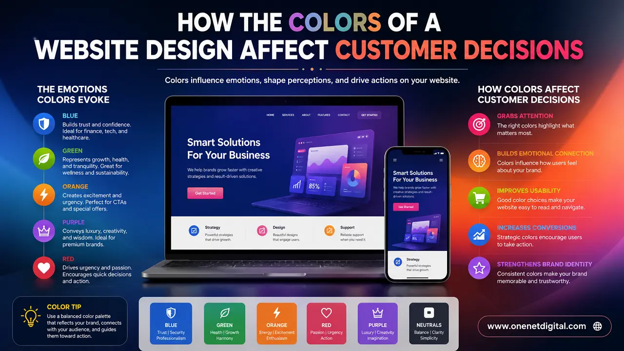
Colors elicit different emotional responses. Some colors instill trust and calmness; others create urgency, excitement, or confidence. Businesses that understand the psychology of color can create websites that are more comfortable, more trustworthy, and more conversion-driven.
Many companies choose colors without considering how users emotionally respond to them, just because it is their own preference. But website colors can directly impact engagement, readability, customer trust, and even buying decisions.
Search engines like Google also look at user experience signals, so visual comfort and usability indirectly help improve the performance of a website over time.
The good thing is that businesses don’t always need a complete redesign to get better results. Small color adjustments can make a big difference in how users experience a website.
Colors Make First Impressions Instantly
Colors immediately impact the feel of the brand when visitors open a website. Visual appearance already influences users’ opinions before they even start reading content.
A website with professional, balanced colors generally feels more modern and trustworthy. On the flip side, bad color combinations can make a good business look outdated, confusing, or unprofessional.
People already associate colors with emotions and expectations. For example, darker colors typically give a premium or professional vibe, while brighter colors can seem energetic or playful. Soft colors can produce calm experiences, whereas too aggressive colors might feel difficult or distracting.
That’s why color choice is much more important to a lot of companies than they realise. The emotional impact of colors significantly affects the users’ choice to keep browsing or leave the website in no time.
The Colors of Your Website Affect Customer Trust
Trust is one of the biggest factors in conversion online. Since customers can’t physically interact with a business online, the visual presentation of the business is very important.
The color of a website can greatly influence the credibility of a business. Clean, balanced color schemes tend to evoke a feeling of dependability and professionalism. Conversely, websites that employ randomly or too harshly chosen colors can seem less credible.
Users often expect a calm, organized, and secure vibe from websites in sectors such as finance, healthcare, technology, and professional services. Color schemes that are too chaotic or overwhelming can cause visitors to lose confidence in the business on a subconscious level.
Color consistency is also very important. Too many competing colors can make websites look disorganized and distracting. Simple and structured color palettes tend to build more trust and better comfort for the users.
By 2026, consumers are more design-aware than ever before, making visual trust signals more important than ever for businesses.
Also Read: Why Businesses Need to Reduce Website Clutter in 2026
Colors Affect User Attention and Concentration
One primary use for businesses to strategically use color is to guide a user’s attention.
Not all parts of a good website are created equal. Important areas such as buttons, offers, headlines and call-to-action areas should attract attention naturally and not overload the user.
Color contrast can help you achieve this balance. Users spot the important elements faster when they visually stand out from the rest of the page and interact more naturally.
But many websites make the mistake of using bright or attention-getting colors all over the place. When every section tries to stand out, it often confuses, rather than guides, users.
Clean websites tend to use colors with a purpose. They establish a visual hierarchy so it’s clear to visitors what to look at next.
This enhances:
- User experience
- Easy to navigate
- Interaction
- Conversion rates
Websites that guide the user’s attention smoothly tend to do much better overall.
Color Psychology Impacts Buying Decisions
Customers often make decisions emotionally before they logically. Colors of a website influence the mood, comfort, urgency, and confidence of the user while surfing.
Some colors, for example, might create a sense of urgency around limited-time offers while others might create a sense of security and stability. Companies deliberately use colors to subtly manipulate customers’ behaviour.
This does not mean that colors alone ensure conversions, but they strongly support the overall user experience. Bad color schemes can make people uncomfortable and less confident. Good use of colors can make the website easier and more enjoyable to use.
Successful e-commerce and service-oriented businesses tend to choose colors that fit their brand personality and what their customers expect. It’s not only about making the website look good, but the goal is also to ensure the emotional consistency of the entire browsing experience.
Also Read: How Heatmaps Help Businesses Understand Visitor Behavior
Too Many Colors Create Visual Clutter
One of the biggest mistakes in website design is using too many colors at once.
Businesses often try to make each section visually different, but too much difference in color causes confusion and visual fatigue. Too many colors can make a design look unprofessional and distracting instead of creative.
The latest trends in website design are focusing on visual balance and simplicity. Clean color palettes tend to create more polished and premium experiences.
Users are more likely to be comfortable browsing a website when they:
- Stay longer
- Explore more pages
- Read content carefully
- Interact naturally
Simplified color systems help visitors focus on information and not be distracted by visual noise that is not needed.
Readability is Also Affected by Website Colors
Color psychology also plays a huge role in readability. Poor contrast between text colors and background colors makes even good content difficult to consume. Some websites use stylish color combinations that may look visually interesting but make reading uncomfortable.
The content on a website should be easy for users to read. If your site is not easy to read, visitors get frustrated and often leave quickly.
Balanced color contrast improves:
- Text clarity
- User comfort
- Accessibility
- Mobile usability
In 2026, websites are expected to feel comfortable across all devices, especially smartphones. Colors affect the readability and accessibility of the content on smaller screens directly. Companies that focus on readability create much better engagement experiences.
Colors Help Build Brand Identity
Branding also requires color consistency. When businesses use consistent color systems across their website, social media, and marketing materials, users start to associate those colors with the brand itself.
Strong visual consistency helps businesses look:
- More professional
- More memorable
- More organized
- More trustworthy
Many successful brands are instantly recognizable because they use the same colors all the time
But branding does not mean using too many colors everywhere. Usually, a simple, well-balanced color palette will deliver far more powerful branding than overly complex designs.
Also Read: Why Your Landing Page Looks Good, But Doesn’t Convert
Visual Comfort Strongly Engages with Mobile Users
As most users surf the web on smartphones, mobile color experience becomes more relevant than ever.
Bright colors, low contrast, or visuals that are too intense tend to feel more uncomfortable on smaller screens. Mobile users prefer clean, calm visuals.
Colors can be too strong or poorly structured, making websites that are balanced on desktop devices seem overwhelming on mobile phones.
Businesses should regularly test how website colors look on different screen sizes and in varying light conditions. Generally, comfortable mobile experiences translate to better engagement and lower bounce rates.
Simpler Color Systems are Often Better
Many companies think the more colors on websites, the more creative they look. But in practice, less complex color systems tend to lead to better user experiences.
Cleanliness of the visual style is trending in modern website design. Users want clarity and comfort, not visual overload.
Simple color palettes make websites look:
- Easier to navigate
- More professional
- More readable
- More trustworthy
So, this is one of the reasons why many successful modern websites do use minimal and balanced color structures instead of overloaded designs.
The goal is not to harm creativity, but to create visual harmony that supports user experience in a natural way.
Conclusion
In 2026, color psychology on websites is an important part of user experience and digital marketing. Colors influence users’ feelings, focus, and interaction with businesses online.
Good color choices increase trust, readability, engagement, branding, and conversions. Even if the services are great, bad color combinations can cause confusion, discomfort, and lower customer confidence.
By understanding how colors affect the behaviour of customers, businesses can create websites that are more professional, user-friendly, and emotionally engaging.
A few tweaks to the color balance and overall visual consistency can go a long way toward improving the performance of your website, often without the need for a complete redesign.
The top websites of today are not simply colorful. They are visually comfortable, emotionally balanced, and easy to trust for users.
FAQs
1. What is the psychology of website colors?
Website color psychology is the study of how colors influence users’ feelings, actions, and decisions while they’re online.
2. Do Website Colors Affect Customer Trust?
Yes, colors have a huge impact on how professional and trustworthy a website feels.
3. Why is color consistency important for brand identity?
Consistent colors help businesses increase brand recognition and visual identity.
4. Do colors affect website conversions?
Yes, colors can affect the attention, emotional behaviour, and interaction behaviour of users.
5. Why should websites not use too many colours?
Using too many colors creates visual clutter, decreases focus, and makes websites appear less professional.