
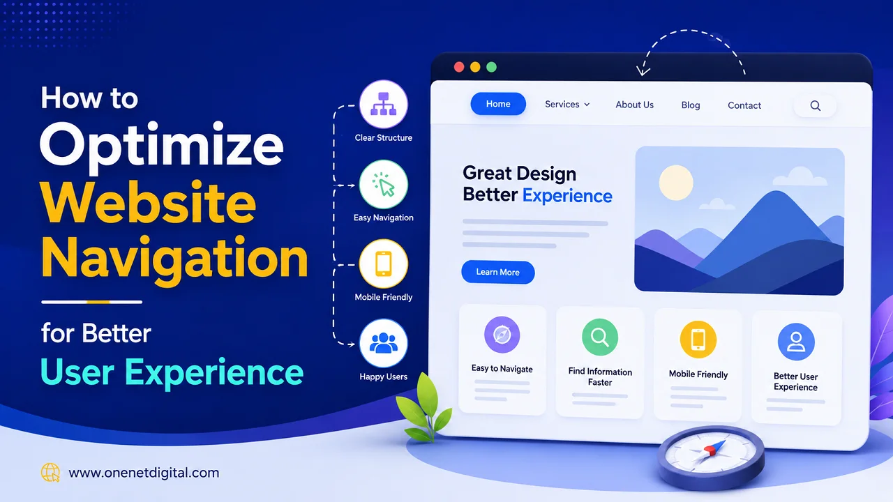
Website navigation is a crucial element in the usage of a website by visitors. But a website can be very attractive, and users may leave quickly if they do not find information easily. A good navigation system helps visitors to flow from page to page easily, and helps to engage and be more visible in search engines.
Modern users want websites to be fast, well-organized, and user-friendly on desktop and mobile. Easy navigation can enhance user satisfaction and also assist businesses in getting better website performance over time.
What is Website Navigation?
Website navigation is the menus, links, buttons, and page structure that make it easy for users to navigate around a website. It functions as a map that directs visitors to important areas like services, blogs, products, or contact pages. Good navigation helps users quickly find information and improves the overall browsing experience.
Why User-Friendly Navigation is Important
In most cases, users decide within seconds whether a website is user-friendly. Visitors who find navigation confusing may leave the site quickly. It improves user experience, boosts engagement, aids in mobile usability, and assists websites in ranking higher in search engines.
Also Read: Why Businesses Lose Customers Due to Poor Website UX
Keep Navigation Simple and Clear
Websites that are easier to use have simple navigation. Menu options can be overwhelming and make it difficult for visitors to browse. Clear labels like “Home,” “Services,” “Blog,” or “Contact” help users easily find the key pages and understand the website structure without confusion.
Use a Logical Website Structure
The structure of a website must be well-organized so that users can easily switch between pages. Related pages should be grouped together under suitable categories. Logical structure allows search engines to understand the hierarchy of the website and crawl more efficiently.
Make Navigation Mobile-Friendly
Many users use smartphones and tablets to access websites, so mobile-friendly navigation is very important. Better browsing experience, smaller screens mean smaller fonts, harder-to-click buttons, and slower loading pages. Responsive menus, readable text, and fast loading pages make it easier to use your website on any device. Hamburger menus are a popular choice for mobile navigation.
Also Read: Why Your Website Loads Fast on Desktop but Slow on Mobile
Add a Search Feature
Search Bar A search bar helps users to find information quickly, especially on websites with a considerable amount of content. Search functionality makes browsing more efficient as visitors can reach specific pages without going through multiple sections manually, which is more frustrating.
Use Internal Linking Properly
Internal links connect related pages on a website. They improve users’ experience by assisting users in finding more content and improving the site structure for SEO. Proper internal linking will also help people discover more pages on your site and keep them on your site longer.
Maintain Consistent Navigation Across Pages
Consistent navigation helps users familiarize themselves with the website design. The menus, buttons, and page structures should be identical on all the pages. Consistency leads to a smoother, more professional browsing experience.
Optimize Navigation Speed
Navigation that loads slowly can negatively impact the user experience. Enhance page load time by optimizing images, eliminating unnecessary scripts, and boosting website performance. The fast-loading navigation enables users to surf the websites more smoothly.
Also Read: Why SEO Traffic Drops After a Website Redesign
Use Breadcrumb Navigation
Breadcrumb navigation is a navigational aid that shows the user where they are on a website. It also shows the path users took to get to the page, making it easier to navigate. Breadcrumbs also help organize content and create a better SEO structure.
Highlight Important Pages
Key pages such as services, contacts, pricing, or support sections should be easy to find. Putting these pages in obvious menu spots makes it easy for users to find important info quickly.
Avoid Broken Links and Dead Ends
Broken links can frustrate users and reduce trust in a website. Regular audits of your website can help you find missing pages, wrong redirects, and errors with navigation. Broken links can be fixed to improve usability and website performance.
Improve Readability and Accessibility
Navigation should be usable by all users, including users with assistive technologies. Readable fonts, proper contrast, keyboard-friendly navigation, and descriptive links make for better accessibility and user experience.
Monitor User Behavior
User behavior analysis also enables the website owners to improve navigation over time. Analytics tools can tell you what pages people visit the most, where they leave the site, and how they move through the website. This information is used for optimizing the navigation for better usability.
Conclusion
Improving overall user experience involves optimizing website navigation as one of the crucial aspects. A well-organized navigation system helps visitors to easily find information, improves website usability, and helps in better SEO performance.
Simple menus, mobile-friendly layouts, internal linking, fast loading speeds, and consistent page structures all help to create a smoother website browsing experience. Website owners and businesses that make user-friendly navigation a priority create better engagement and better long-term website performance.
Websites are constantly changing, but one of the most important elements to keep visitors happy and engaged is simple navigation.
FAQs
1. What is website navigation?
Website navigation refers to menus, links, buttons, and page structures that help users move through a website and find information easily.
2. Why is website navigation important?
Good navigation improves user experience, helps visitors access important pages quickly, and supports better SEO performance.
3. How does simple navigation improve user experience?
Simple navigation reduces confusion and helps users browse websites more comfortably by making important sections easy to locate.
4. What makes a website navigation mobile-friendly?
Mobile-friendly navigation includes responsive menus, readable text, easy-to-tap buttons, and fast-loading design elements for smartphones and tablets.
5. Why should websites include a search feature?
A search feature helps users find content quickly, especially on websites with large amounts of pages or information.