
- Introduction
- Modern Visitors Want Scannable Content
- Information Overload Leads to Decision Fatigue
- Important Messages Lost
- Long Text Can Kill User Engagement
- Mobile Users Have Less Patience
- Too Much Text Hurts Credibility
- The Calls-to-Action Get Less Obvious
- Simplicity Enhances User Experience
- Striking the Right Balance
- Conclusion
- Frequently Asked Questions
Introduction
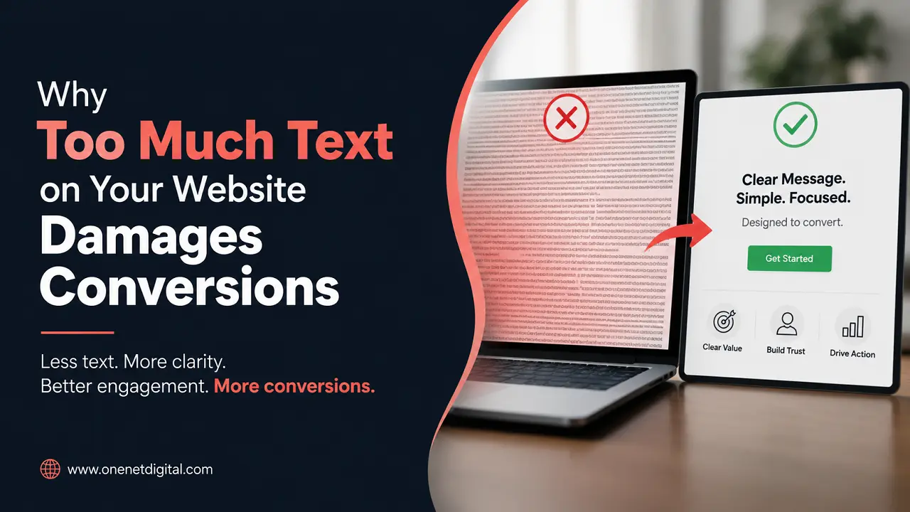
Many companies believe that by adding more words to a website, visitors will automatically better understand their products or services. The rationale is sound: if users have more information, they are better able to make decisions. However, in practice, too much website text can have the opposite effect.
Modern Internet users are daily exposed to huge amounts of information. Generally, when they come to a website, they want quick answers, not long explanations. If you fill a page with large blocks of text, complicated descriptions and endless paragraphs, visitors may be overwhelmed before they ever get to the most important information.
This is one of the reasons many websites suffer from low conversion rates. It’s not always bad design or bad marketing. The problem may be that visitors have to work too hard to find the information they need.
The successful websites of 2026 will be clear, readable and user-friendly. They give enough information to create trust without a large number of contents that adds friction to the decision process.
Modern Visitors Want Scannable Content
Most people don’t read websites word for word. Instead, they skim pages for relevant information that gets them to their goal quickly.
Visitors to a site are often searching for answers to a few important questions. What does the business offer, how can it help them, why should they trust it and what should they do next.
And if these answers are in long paragraphs, users could lose interest before they find them. More text to process takes more effort and increases the chances of the visitors leaving the site.
Information should not be hard to find on a website. Well-structured content, short explanations, and clear headings help users to understand important messages without feeling overwhelmed.
Information Overload Leads to Decision Fatigue
One of the biggest reasons too much text on a website kills conversions is information overload.
The more data people have to work with, the harder it is for them to make decisions. They don’t feel informed, they feel uncertain because they are trying to take in too much information at one time.
This is called decision fatigue. The more effort users put into understanding a page, the less likely they are to take action.
So many companies by mistake do this by putting every single feature, every benefit, every company accomplishment, and every technical detail onto one page. Details like this can be useful, but when you throw all of them on a page at once, it can make the page harder to use.
You want to lead the visitor up to a decision—not drown him in information.
Also Read: How Micro-Animations Enhance Website User Experience
Important Messages Lost
When there’s too much text on a webpage, it can be hard to find the important stuff.
The most important information on a page should be visible immediately to visitors. The important information should be clear and stand out, whether it is a service benefit, a unique selling point or a call-to-action.
But these messages can get buried under large chunks of content. Users may find it difficult to determine what to pay attention to and what to ignore.
This is a problem especially on service pages and landing pages where businesses try to say everything all at once. The additional content doesn’t clarify; it often confuses the message.
Generally, one powerful message is more effective than many competing messages on a page.
Long Text Can Kill User Engagement
Website engagement is heavily reliant on how easily its content is consumed.
When users see a long, dense block of text, many will stop reading and start scrolling quickly, looking for something easier to break down. Others may just leave the page altogether.
This is especially true on mobile devices, where reading large amounts of content can be even more challenging to do. Too long paragraphs, too many explanations and repeated information tend to reduce overall user experience.
Short content doesn’t have to be engaging content. The difference is that engaging content reads easy and provides value quickly.
I would suggest businesses should be about clear communication of information not a word count increase.
Mobile Users Have Less Patience
Mobile usability is a major part of conversion optimization as the majority of site visits are still on mobile devices.
Many smartphone users surf the Web while multitasking or looking for quick answers. In general, they have less patience for long content than desktop users do.
Landing on a page loaded with too much text can be a bit overwhelming for a mobile visitor. The endless scrolling and big blocks of content make it more difficult to pick out the important information.
A site that may appear manageable on a desktop screen can feel much more cluttered on a smartphone. This explains why companies need to think about how their content will look on different devices.
The easier content is to scan and read on mobile, the more likely visitors will stay engaged.
Also Read: Why Your Website Homepage is Confusing Visitors
Too Much Text Hurts Credibility
Many businesses think that more information automatically means credibility. More information can certainly increase trust, but there is a point at which too much information starts to have the opposite effect.
Visitors often mistake clarity for confidence. Users feel more comfortable when businesses communicate in a clear and direct way. On the other hand, over explaining can cause visitors to question why so much justification is needed.
They can read like a sales pitch rather than a helpful resource when they are filled with repetitive statements. This may damage trust, and make users more critical.
More words on a page don’t create trust; relevant information, transparency and user experience do.
The Calls-to-Action Get Less Obvious
Each conversion-focused page should direct the user to a definite action. Whether that’s to buy a product, request a quote, book a consultation or fill out a form, visitors should always know what to do next.
Calls-to-action can get lost in a lot of content. Too much text dilutes calls-to-action. They may never get around to them or they may lose interest before they get there.
A strong call to action is most effective when it is delivered at the right time, and is backed up by clear, relevant information.
If pages are too long, the user journey can lose focus and the impact of conversion opportunities is reduced.
Simplicity Enhances User Experience
One of the most successful trends in modern web design is simplification.
Businesses are waking up to the fact that users prefer clarity to complexity. Good websites don’t try to tell you everything up front. They prioritise information and lead you through it.
That doesn’t mean deleting the important stuff. It means creating a sense of manageability and user-friendliness in how content is organised.
And users should never have to struggle to understand a web site. The easier you make it to consume information, the more likely a visitor will stick around and move closer to conversion.
Often a simple communication works better than a long explanation.
Also Read: How to Make Your Website Feel Human and Personal
Striking the Right Balance
The answer is not to make every page ultra-short. Some topics are better suited for detailed explanation. Especially when it comes to technical services, professional industries or complex products. The key is in the balance.
Businesses should give enough information to answer important questions, but not too much repetition and filler content. Each section has a purpose, and brings the user closer to a decision.
“Quality over quantity” is a good website. Businesses should be asking themselves, ‘What information does the visitor really need?’ rather than, ‘How much content can we add?’
This approach often leads to higher engagement and better conversion rates.
Conclusion
Too much website content can harm conversions by overwhelming visitors with information, leading to decision fatigue, burying important messages, and lowering content consumability. Businesses try to add more content with good intentions, but too much text becomes a barrier instead of helping users.
Visitors today want websites that are clear, organised and easy to browse. They want content that answers their questions quickly and gets them to the next step.
The best websites in 2026 are not the websites with the most content. They have to be able to transmit the correct information in the clearest, most user-friendly way possible.
By focusing on readability, clarity, and user experience, businesses can create websites that are more engaging for visitors, leading to higher conversion rates over time.
Frequently Asked Questions
1. Is it true that too much text kills website conversions?
Yes, too much text can be overwhelming for the visitors and make decision making harder.
2. Why do users avoid reading long pages of websites?
Most users scan content rather than read every word, especially when searching for quick answers.
3. What is the impact of information overload on conversions?
But too much information can cause confusion and decision fatigue, which lowers the chances of action being taken.
4. Is short content always good?
No, content should be long enough to answer user questions, but short enough to remain easy to consume.
5. How can the readability of content be improved?
Use headings, short paragraphs, a logical structure and focus on the information that users really need.