
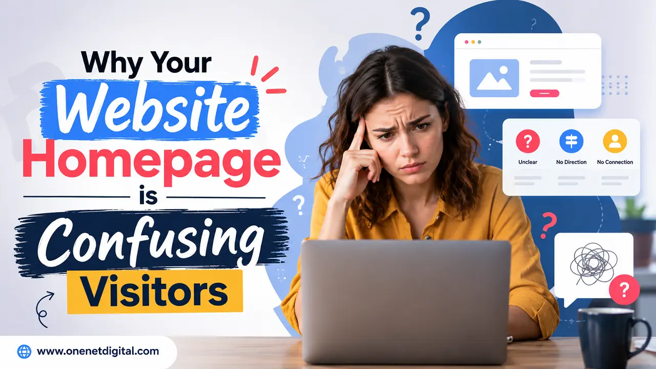
- Introduction
- Visitors Can’t Immediately Realize What You Do
- Too Much Information Creates Overload
- Navigation Structure is Not Clear
- Too Many Call-to-Action Competing for Attention
- The Design Prioritizes Looks Over Usability
- Mobile Users Face Additional Hurdles
- Important Information is Hidden Below the Fold
- The Homepage Feels Meaningless with Generic Content
- Confusing Visual Hierarchy for Users
- Confusion on the Homepage Often Reduces Trust
- Conclusion
- FAQs
Introduction
Your homepage is usually the first thing people will interact with your business. The visitor can come to the homepage from search engines, social media, online advertising, or by someone sending them directly. But the visitor usually starts at the homepage. In just a few seconds, users start to develop perceptions of your business and determine if they want to keep looking around your website.
Unfortunately, many businesses create homepages that confuse visitors rather than guide them. It appears modern, the content is seemingly informative and the website functions correctly but users still leave without action. The trouble is not, in most cases, the lack of information. The core problem is that visitors have a hard time figuring out what the business does, who it’s for, and what they should do next.
User attention spans are the shortest they’ve ever been by 2026. Websites are expected to provide clear answers almost immediately. People generally leave if a homepage looks confusing, overwhelming or hard to navigate before visiting other pages.
The first step to a better user experience, and more engagement, trust and conversions, is understanding what causes homepage confusion.
Visitors Can’t Immediately Realize What You Do
A common problem with homepages is they don’t clearly explain the business. A lot of websites use clever headlines, marketing taglines or industry buzzwords that sound impressive, but don’t actually tell visitors what the company does.
When someone arrives on a homepage, they should be able to answer a few basic questions in seconds. They should understand the business, the target customer and how the business differs from its competitors.
Many businesses assume visitors understand their industry or services, but most users are seeing the website for the first time. If they need to work too hard to find out what the company actually does, they usually leave and seek elsewhere.
A homepage should not be creative over clear. Don’t let your website visitors guess what your website is for.
Too Much Information Creates Overload
Another big reason homepages confuse people is information overload.
Businesses often try to do everything on the homepage at once. They put every service, every promo, every company accomplishment, every blog post, every marketing message onto one page. The intention is usually good, but the result can be overwhelming.
Too much information too fast makes it difficult for visitors to determine what is most important. They feel distracted rather than informed.
Modern websites perform best when information is properly prioritized. Users should be led through content step by step instead of being forced to digest it all at once. The homepage should introduce the business and point visitors to relevant sections, not try to explain the whole company in one place.
Also Read: How to Make Your Website Feel Human and Personal
Navigation Structure is Not Clear
Site navigation is important in the user experience. Visitors get quickly frustrated if they can’t find what they are looking for easily.
Many companies build navigation menus that are too complicated, or too vague. Some sites have excessive menu items and some use labels that are difficult for users to comprehend.
Visitors should not have to guess to find information. Navigation should feel natural and predictable. Logical menu structures guide users through the website with confidence.
Often, visitors will leave the site if the information they need actually exists somewhere on the site, but the navigation structure is confusing.
Too Many Call-to-Action Competing for Attention
Many home pages try to get the visitor to do several things at once. Businesses can ask users to contact them, subscribe to a newsletter, download a guide, read a blog, watch a video, follow social media accounts and browse services, all on the same page.
When too many actions are competing for attention, users are often left unsure of what to do next.
A home page should guide, not add to decision fatigue. Sometimes you’ll need more than one, but always be sure you have a clear primary action that guides visitors naturally through your site.
The easier you make the decision process, the more likely a visitor is to engage.
The Design Prioritizes Looks Over Usability
Businesses can encounter usability issues when modern design trends become too appearance-focused.
Big animations, weird layouts, too many visual effects and creative interfaces may look impressive but can make websites more difficult to understand. Visitors are seeking information, not design features that will impress them.
Your homepage should work with the user experience, not fight it. Good design helps users navigate information better. Bad design creates distractions that make important content harder to find.
In many cases, taking away visual elements will actually increase engagement because it allows the visitor to focus on what’s most important.
Also Read: Why Most Companies Use Too Many Plugins on Their Website
Mobile Users Face Additional Hurdles
Mobile usability is more important than ever because most website traffic is from smartphones.
A homepage that looks great on a desktop computer can become confusing on a mobile device. Long pages, cluttered layouts, large images and confusing content can frustrate mobile users.
You can expect speed and simplicity when browsing on a mobile phone. They want information that is clear and accessible. Visitors will usually leave very quickly if they have to zoom and scroll too much or hunt for basic info.
If a company is regularly testing its homepage on different screen sizes, it is more likely to identify usability problems before they affect its conversions.
Important Information is Hidden Below the Fold
Too many companies hide key information too far down the homepage.
People will scroll if they find the content useful, but brands shouldn’t expect every visitor to make it to the bottom of the page. Key information such as services, value propositions, contact info, or key benefits should be presented early in the browsing experience.
Visitors may have to scroll through a number of sections to get to the point where the business explains what it offers and many will leave before they get there.
The homepage should get the most important messages across quickly and clearly. Important information should not be a scavenger hunt for users.
The Homepage Feels Meaningless with Generic Content
Many sites use boilerplate language that could be used for just about any business. You’ll find lots of websites talking about high-quality solutions, excellent customer service and industry-leading expertise.
Such statements are true but usually have no useful information. Visitors are looking for the particulars that help them understand why you matter to them. Generic messaging makes all sites look the same.
Messaging that’s explicit and well-defined helps users to connect to the business more easily and reduces confusion about what makes the company special.
Confusing Visual Hierarchy for Users
Visual hierarchy refers to the organization and display of elements on a page. It helps users see what is most important and where to focus their attention.
When all parts of a homepage are treated equally, users don’t know where to focus. Confusion can be caused by large blocks of text, inconsistent headings, competing colours, and cluttered layouts.
A good homepage flows naturally from section to section. Important content is clear and easy to find, and supporting content is available. A good visual hierarchy improves readability, engagement, and overall user experience.
Also Read: How the Colors of a Website Design Affect Customer Decisions
Confusion on the Homepage Often Reduces Trust
Trust is one of the most important factors for decision making online. Users who are confused are less confident in the business behind the website.
A confusing homepage can cause questions like:
- What does this company actually do?
- Can I trust this business?
- Where can I find the information, I need?
- Why is this website so difficult to understand?
A confusing first impression can do a lot to reduce credibility even if a business has great products or services.
Good communication, easy navigation and well-organized content all help develop a stronger sense of trust and professionalism.
Conclusion
A confusing homepage can quietly harm website performance by increasing bounce rates, decreasing engagement and preventing visitors from taking action. Often companies add more content, more design features and more marketing messages, not realizing that simplicity is usually the best answer.
The best home pages aren’t always the most creative or feature-rich. It is they who explain the business in a clear way, guide visitors in a natural way and make the information easy to understand.
In 2026 websites need to be fast, simple and intuitive. Businesses that are clear, usable and provide a good user experience tend to make a better first impression and deliver better results in the long run.
If your homepage lets visitors instantly understand who you are, what you offer, and what they should do next, it’s a powerful tool for building trust and conversions.
FAQs
1. Why do visitors get confused on my homepage?
Your homepage is cluttered with too many calls-to-action, or has poor navigation, unclear messaging or too much information.
2. How fast do visitors judge a homepage?
Most users will form an opinion about a website within a few seconds of arriving on it.
3. Is homepage confusion hurting conversions?
Yes, confused visitors are less likely to engage with, contact your business, or complete conversions.
4. What should visitors see first on a homepage?
They should be able to quickly identify what the business is, who it serves and what to do next.
5. Is a simple homepage better for the user experience?
Yes, a more simple and focused homepages tend to increase engagement, trust and conversion rates.