
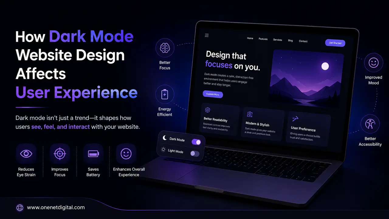
The design of dark-mode websites is a major trend in today’s UI/UX design. Most popular apps and websites now offer a dark theme in addition to the standard light interface. But beyond looks, dark mode really impacts how users feel, interact and engage with a website.
In this article, we will talk about the effect of dark mode on user experience, its advantages and disadvantages, and when it should be used in web design.
What is Dark Mode in Website Design?
Dark mode is a design style in which a website uses dark coolers as the background, such as black, deep grey, or navy blue, with text and UI elements displayed in lighter shades. Dark mode reverses this contrast. It uses light on a dark background, rather than dark on a light background. It offers a softer, less-bright visual experience and is widely used in websites, mobile apps, and operating systems.
Why Dark Mode Became Popular
Dark mode has become fashionable because users spend many hours in front of screens and need more comfortable viewing options. Helps reduce eye strain, particularly in low-light conditions. It is also preferred by many users for better content focus and, in some devices, improved battery efficiency. Over time, it has become a standard UX feature, not just a design trend.
Also Read: Why Visitors Ignore Your Call-to-Action Buttons
Impact of Dark Mode on User Experience
Reduced Eye Strain in Low Light
Dark mode is easier on the eyes when users visit websites in dim light or at night. It dims the screen, making extended reading sessions more comfortable. But the right contrast matters. Poor design can make it hard to read.
Improved Focus on Content
Dark mode makes the background less bright, so it’s easier to see the text, images and buttons. This helps users to focus better, especially on media-heavy websites, dashboards and reading platforms.
Aesthetic Appeal and Modern Look
Dark mode gives websites a premium and modern look. It is used by many technology and entertainment platforms for its sleek, minimalist look. But design has to balance aesthetics with readability.
Battery Efficiency on Devices
Dark mode can save battery on OLED and AMOLED screens, since dark pixels use less power. This makes it helpful for mobile users who spend a lot of time browsing or using apps.
Reading Comfort and Accessibility
If you are sensitive to bright light, dark mode can be more comfortable. But it doesn’t work for everyone, and some users find light text on dark backgrounds more difficult to read. The best solution is often to support both light and dark modes.
Also Read: Why Most Websites Fail to Build Customer Trust Online
Impact on Readability and Contrast
Dark mode design is very much focused on readability. Unbalanced contrast can make text less clear and impact user experience. The choice of coolers for your text, background and UI elements is important.
Emotional and Psychological Effect
Dark mode provides a calm, focused experience for users. It reduces visual stress and can even encourage longer browsing sessions. However, depending on the design style, some users may find it a bit too formal or less friendly.
Challenges of Dark Mode Design
But dark mode has its pitfalls. Designers need to ensure legibility across devices, maintain brand consistency, and avoid overly harsh contrast. Light and dark themes require optimizations of images and graphics. It is also important to handle user preferences correctly.
Best Practices for Dark Mode UX Design
Some key practices for good dark mode design. But the great thing is that it’s not an impossible dream. Do not use pure black backgrounds; use softer dark colours. Test designs on different devices/screen sizes. Always provide a toggle that lets users easily switch modes. Maintain distinct visual hierarchy for buttons, headings and content.
When to Use Dark Mode
Dark mode is great for entertainment platforms, dashboards, creative portfolios and streaming websites. It is especially useful at night. If your website is content-heavy or reading-oriented, the best option for a better user experience is to offer both light and dark modes.
Also Read: How to Improve Website Engagement Without Redesign
Conclusion
Dark mode website design is a very important thing for user experience. Done right, it can make you more comfortable, relieve eye strain and look better. At the same time, it requires careful planning to keep it readable and accessible.
The best user experience is a balance that offers the user flexibility while ensuring strong design principles in both light and dark environments.
FAQs
1. What is dark mode in website design?
Dark mode is a design style in which websites use dark backgrounds, such as black or deep grey, with light-coloured text and UI elements. It reduces brightness, creating a softer visual experience.
2. Why is dark mode used in websites?
Dark mode reduces eye strain, improves readability in low light, and gives websites a modern, clean appearance. It is also preferred by many users for comfort during long periods of screen use.
3. Does dark mode reduce eye strain?
Yes, dark mode can help reduce eye strain in low-light environments. However, proper contrast is important; poorly designed dark mode can make reading harder, not easier.
4. Is dark mode better for user experience?
Dark mode can improve user experience by enhancing focus, reducing brightness, and offering a modern look. But its effectiveness depends on proper design and user preference.
5. Does dark mode save battery?
Yes, on OLED and AMOLED screens, dark mode can help save battery life because dark pixels consume less power than bright ones.
